

This brand spotlight follows the journey of bringing Vanessa Jasper’s voice into form. As a yoga teacher, her work lives in that beautiful space between the seen and the felt and the entire brand grew from that place. Nothing here was forced. Everything unfolded the way her teachings unfold with steadiness clarity and a kind of grounded mysticism that does not need to be loud to be powerful.
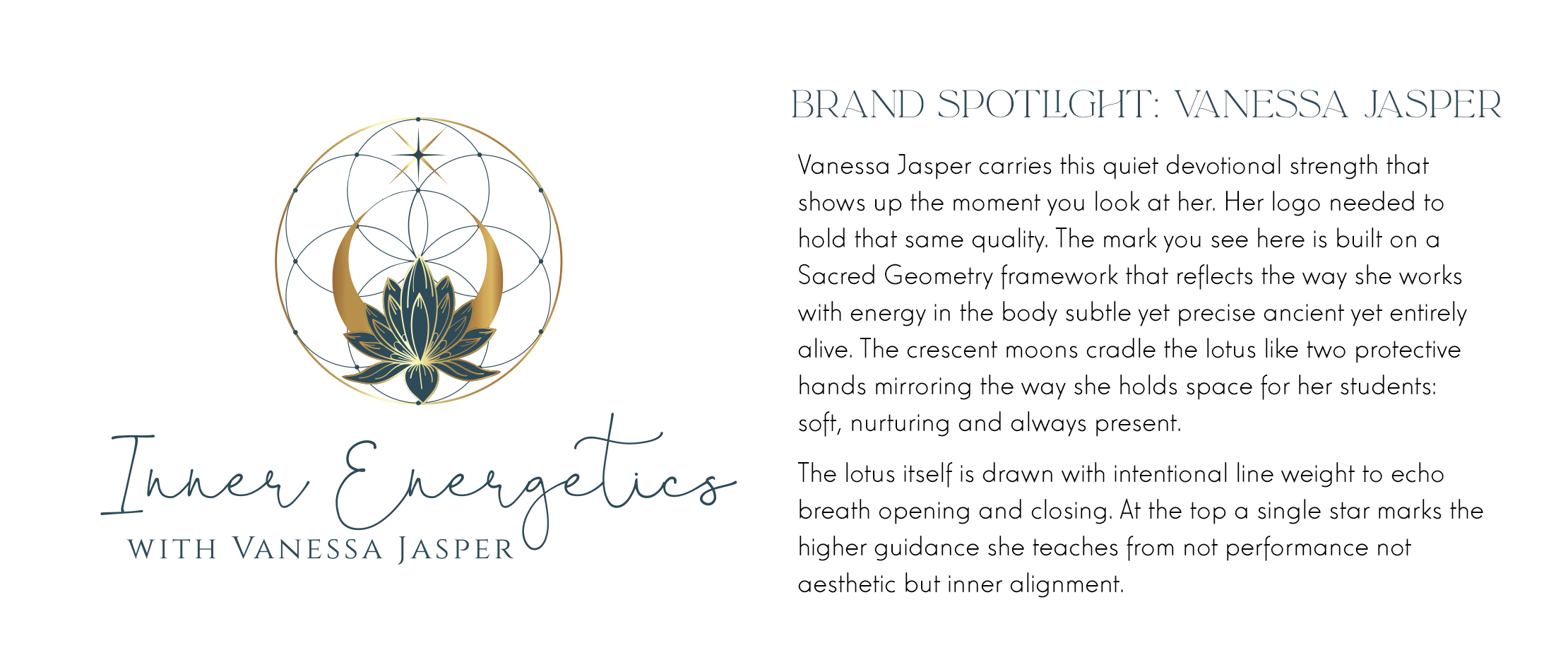
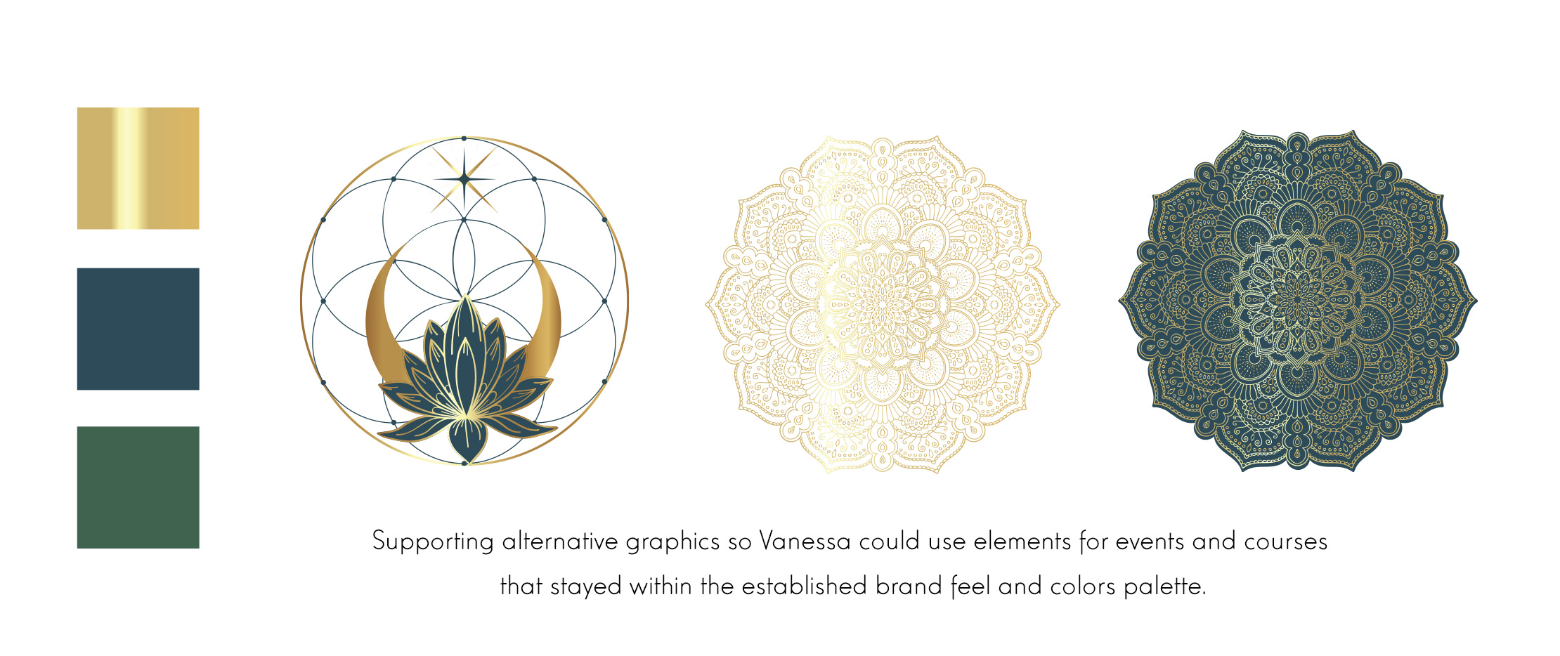
Inner Energetics carries a calm presence and the design mirrors that. Deep greens for the symbolize the heart of work. Warm gold where illumination rises through the body. The pairing carries the same steady clarity she brings into a room and it sets the tone for her entire brand. The mark we created for her feels like an exhale. It is clean simple and quietly sovereign the way she is with her students.
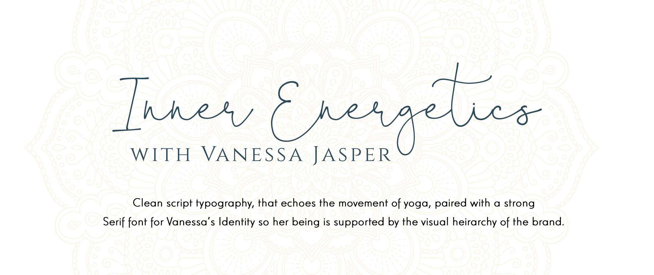
This design reflects how her brand came together through instinct and attention rather than just “yoga teacher” strategy. It shows the subtle refinements that gave her identity its shape the typography that feels supportive instead of showy the spacious compositions the way her logo breathes on the page.
The visuals hold her work without overwhelming it. They let you feel her steadiness, as a yoga teacher her logo that is a foundation of her visuals and brand. This is visual storytelling for practitioners and creative direction rooted in presence not performance. This logo is the key to exploring your spiritual brand as an embodiment of your soul’s purpose.
The Vanessa Jasper feature reveals the kind of brand journey that Aurelia creates when she lets someone’s truth lead. This isn’t just graphic design it’s co-creation with a client for their purpose’s vision. It traces how Vanessa’s inner clarity became outward expression and how a brand can feel like a reflection not an invention. This is the heart of Aquarian Creative’s approach but more importantly it is the heart of Vanessa’s work made visible.


Leave a Reply