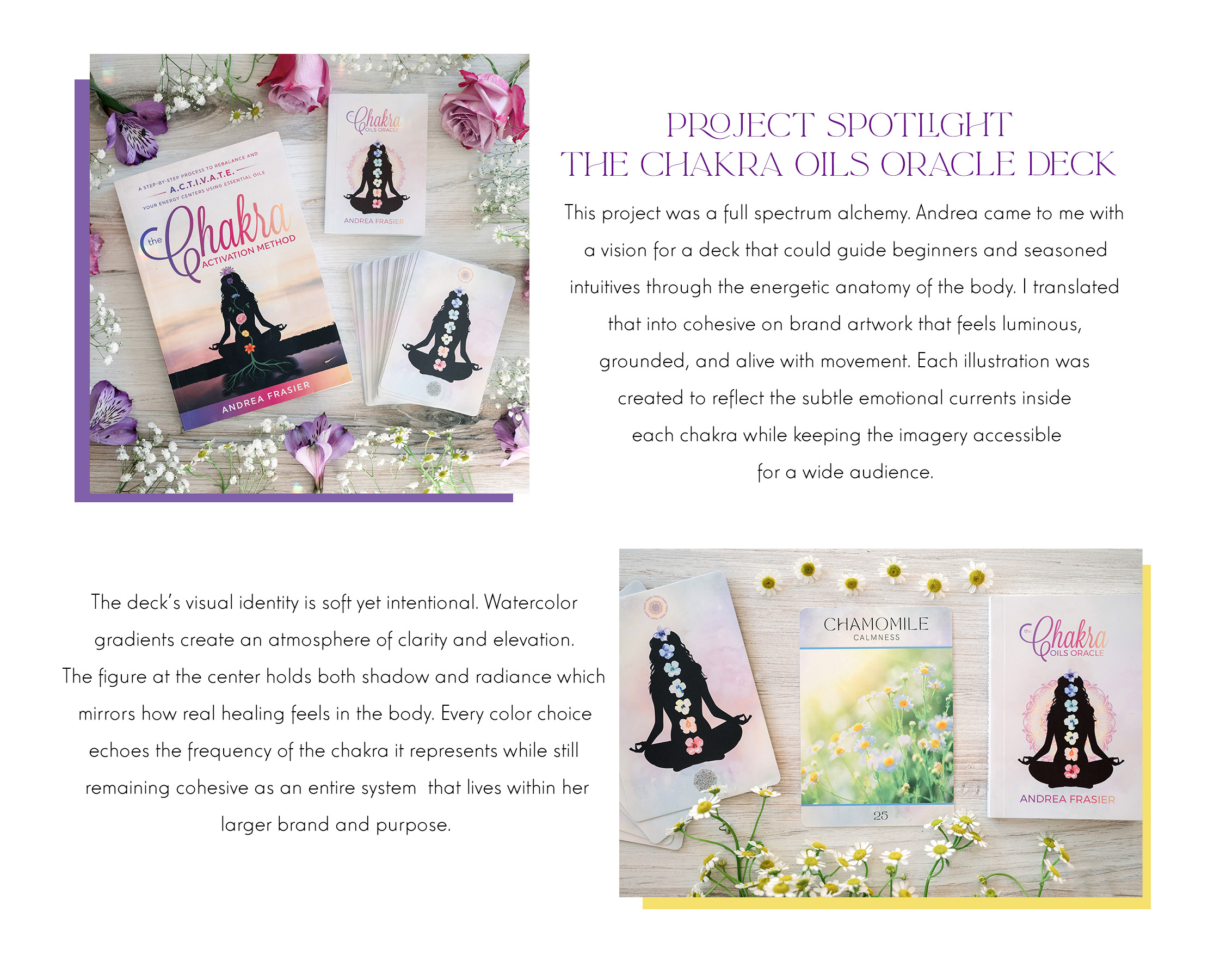
This project captures what happens when spiritual practice meets seasoned creative direction. Every element of this deck and oil line was shaped with intention. From the way the colors mirror the inner architecture of each chakra to the way the typography feels like a breath drawn slowly and released with presence. The entire experience is built to guide someone inward, not overwhelm them with noise. That is the Aquarian Creative signature. Depth without clutter. Beauty with purpose. Story embedded in every layer.
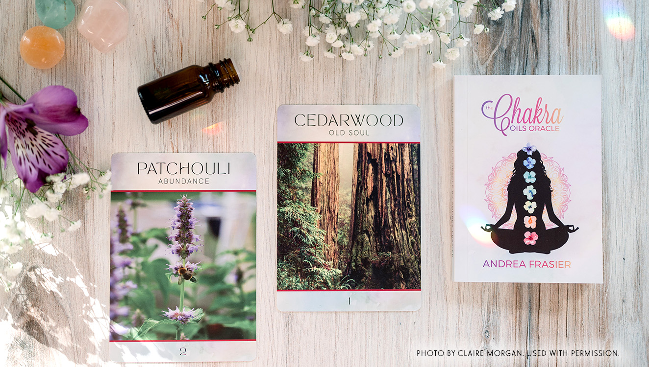
A chakra based oracle deck asks for more than aesthetic styling. It asks for trust. It asks for clarity. It asks for a translator who understands both symbolism and the lived feeling of transformation. This is the heart of how I build spiritual brands. I anchor them in truth, energy, and coherence so they feel like a sanctuary in the hands of the reader.
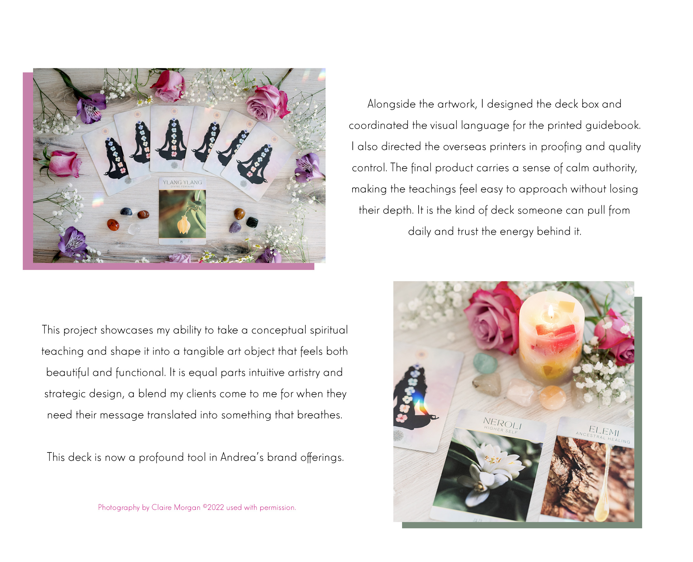
This case study stands as a guide for anyone building a spiritual business. It shows how intentional design supports intuitive tools. It shows how cohesive visual identity strengthens a brand’s presence across oils, cards, packaging, and photography. Most of all it shows how a handmade product becomes a living system of meaning when the visuals, language, and energetic purpose all align.
If you are creating a soulful product line, building your own oracle deck, or expanding a spiritual brand with clarity and refinement, this is the level of devotion and detail that elevates your work. This is how you build a visual language that teaches before you ever speak.


Leave a Reply